Three tablet screens showing various functionalities of the eNCPT application, including nutritional care plans and patient assessments with an orange background.

eNCPT 🔒

A web app for dietitians and nutritionists to efficiently evaluate, diagnose, and monitor patients' nutritional care.

Category

Healthcare

Company

Enterprise

Design System

Primer

Year

2023

Three tablet screens showing various functionalities of the eNCPT application, including nutritional care plans and patient assessments with an orange background.

eNCPT 🔒

A web app for dietitians and nutritionists to efficiently evaluate, diagnose, and monitor patients' nutritional care.

Category

Healthcare

Company

Enterprise

Design System

Primer

Year

2023

Three tablet screens showing various functionalities of the eNCPT application, including nutritional care plans and patient assessments with an orange background.

eNCPT 🔒

A web app for dietitians and nutritionists to efficiently evaluate, diagnose, and monitor patients' nutritional care.

Category

Healthcare

Company

Enterprise

Design System

Primer

Year

2023

Three tablet screens showing various functionalities of the eNCPT application, including nutritional care plans and patient assessments with an orange background.

eNCPT 🔒

A web app for dietitians and nutritionists to efficiently evaluate, diagnose, and monitor patients' nutritional care.

Category

Healthcare

Company

Enterprise

Design System

Primer

Year

2023

Lessons

This project underscored the critical role of user research in crafting innovative healthcare user experiences. By talking to users and grasping their challenges with usability and repetitive data entry, I designed meaningful improvements. These changes boosted efficiency and cut the time spent by almost 50%, ultimately creating a user experience that truly served them.

Overview

How might we…streamline the approval process and increase input from practicing Registered Dietitian Nutritionists (RDNs) to enhance the timeliness and accuracy of patient care through the Nutrition Care Process Terminology (NCPT)?

Problem

The prolonged approval process and limited input from practicing Registered Dietitian Nutritionists (RDNs) in the development of the Nutrition Care Process Terminology (NCPT) impacts their ability to provide timely and accurate patient care.

Success


Building empathy

We learned that while RDNs bring different viewpoints, having too much of the same information can make things repetitive, lowering its overall usefulness. Also, without easy-to-use platforms for collecting and analyzing data, it's difficult for RDNs to be heard.

Interviewees

Monique Lisowski, RDN
PACT Dietitian at James A. Haley Veterans’ Hospital & Clinics

Tennille Yates. RDN
Clinical Nutrition Director at AdventHealth

Lauren Dinour, RDN
Associate Professor at Montclair State University

What we heard

Lack of intuitiveness

"I think, at the end of the day, I like software that is intuitive and doesn't make me have to click around unnecessarily. It's one of my biggest frustrations with the current eNCPT portal; I just don't think it's intuitive. I find that I have to click through too many weird drop-downs. It's a digital encyclopedia. When I first saw it, I thought, 'Wow, this feels like an encyclopedia.' User-friendliness isn't necessarily at the top of their list. I use it because I have to, since it's the only thing that exists. I've gotten used to it now, but it's hard for new students to learn every semester."

Repetitive data

"There's just a lot of menu options that I don't understand. If I look at the drop-down boxes on the main page of the eNCPT, across the top in that little blue area, there's a drop-down for terminology. Then you've got assessment, diagnosis, intervention, monitors, and then there's a reference sheet. It's pretty much the same thing but displayed differently. Whether you're looking at the terminology drop-down or the reference sheet drop-down, it's always a little confusing. And then you also have the snapshot for each one. It just seems like everything is in so many places, which makes it a bit confusing."

Inability to participate in the process

"Because this portal used to be a book, it makes sense. Ten years ago, it started out as a book, and then every year or two, there would be a new edition with updated codes and terms. People started getting upset about having to buy a new book every couple of years, so they came out with this portal. Then people got upset because they couldn't buy a book anymore. It's funny how that happens.

I think it's always been that if you have a recommendation or suggestion for a new term, you email someone—I'm not sure who, maybe it's somewhere on the portal. But you can suggest a new term, and there's a process to determine if it will be added. It would be nice if you could submit that directly through the application. If you need a term that's not available, you could say, 'I think you should have this,' and also ask, 'What should I use instead? If I don't have a term like this, what do I use?"

Persona

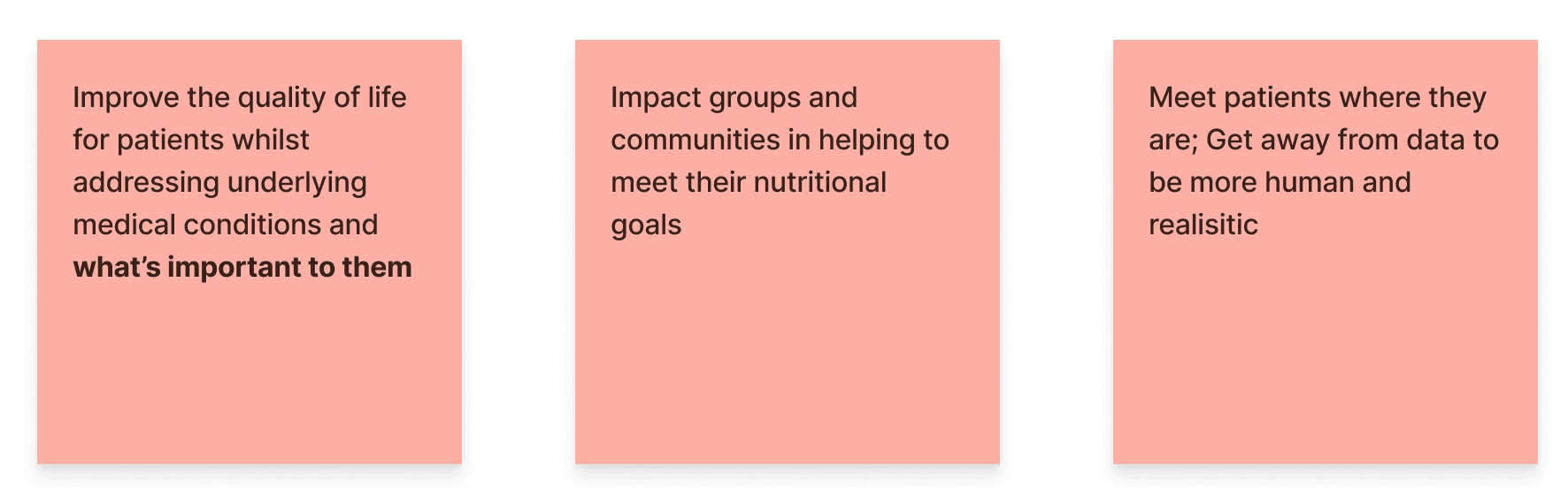
Goals
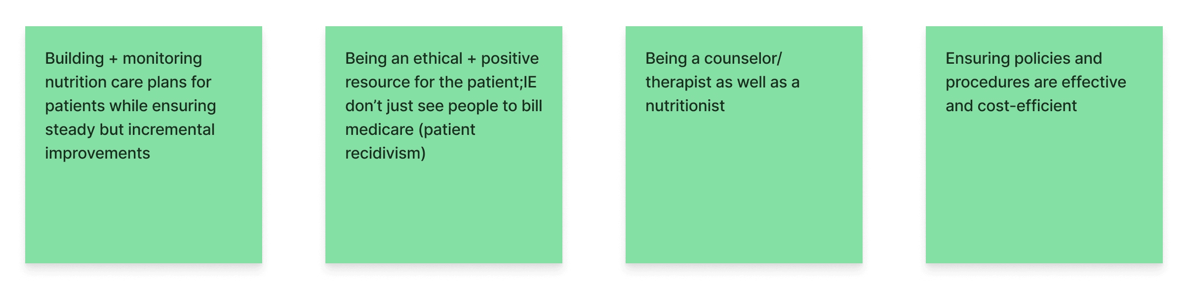
Responsibilities
Prioritization
Frustrations
Changes (if in charge)


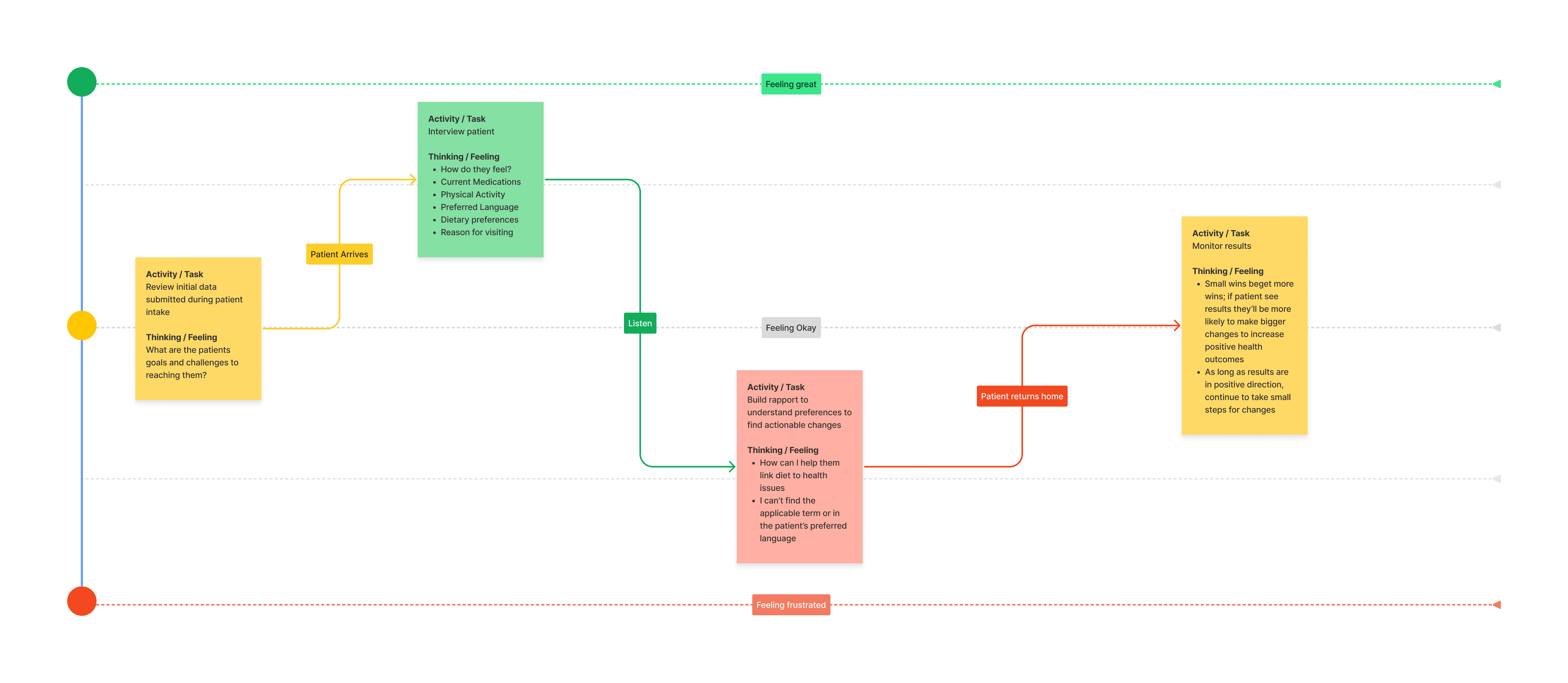
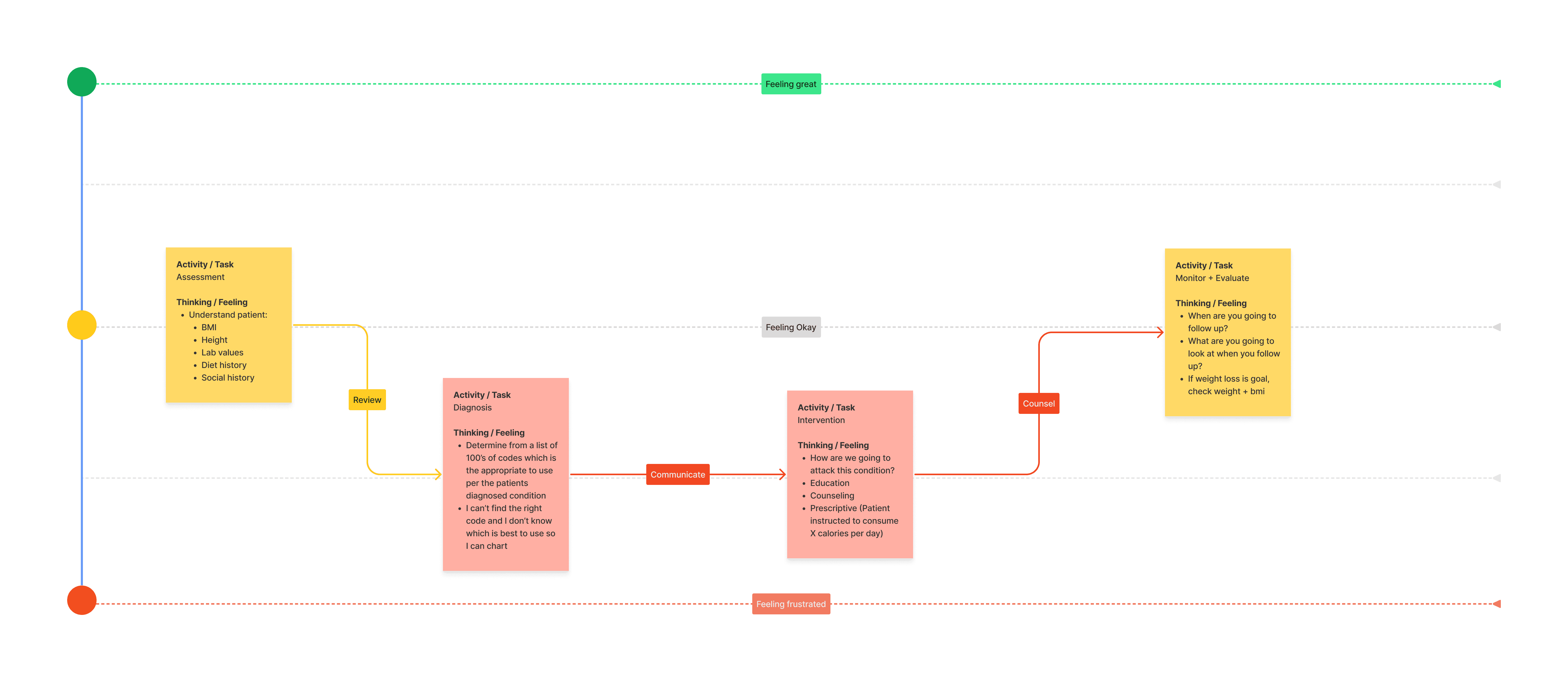
Journeys

Patient Consultation
Charting

Design

Why Primer?


We chose the Primer Design System due to its React-based architecture, comprehensive components, intuitive layout, and versatile Octicons. Primer's well-designed components and responsive layout tools ensure a seamless user experience across various devices, crucial for healthcare professionals.

The integration of Octicons provides a consistent, recognizable iconography that enhances the interface's clarity and usability. React's component-based architecture supports maintainability and scalability, making Primer an ideal choice for our development needs.

Features

Home

A tablet displaying the Home screen for a nutrition care process platform. The screen features a dashboard with sections titled 'Industry News,' 'New Terms,' and 'Resources' on the left. On the right, there is an embedded video player showing a YouTube video with the title 'Electronic Nutrition Care Process Terms' and the 'eat right' logo.

A comprehensive dashboard, providing access to industry news, new terms, and key resources, along with an embedded video for user education to facilitate a consistent approach to documenting nutrition care.

Favorites

A tablet displaying the Favorites screen for a nutrition care process platform. The screen shows a list titled 'My Terms,' with several entries for different nutrition-related terms such as 'Malnutrition' and 'Nutritional Risk.' Each entry includes definitions, relevant codes, and options to favorite or edit the term. The interface includes navigation menus on the left.

A personalized view where users can see detailed definitions and relevant codes for various terms, with functionalities to favorite, edit, and organize these terms efficiently.

Term

A tablet displaying the Term screen for a nutrition care process platform. The screen is divided into several sections, including 'Step Overview,' 'Intro,' 'Actions,' 'Care Continuation,' 'Similarities,' and 'References.' It details the nutrition assessment process with text and highlighted updates. Navigation menus are visible on the left side of the screen.

A comprehensive guide to the nutrition assessment process, featuring an overview and detailed sections for Intro, Actions, Care Continuation, Similarities, and References, with functionalities to suggest changes, highlight critical information, and view recent updates.


Agent Concept

Story Map
A large screen showing a Story Map for the Agent Concept in a nutrition care process platform. The map is divided into multiple columns with headings like 'Install,' 'Use,' 'Assessment,' 'Diagnosis,' 'Intervention,' and 'Monitoring.' Each column contains numerous colored sticky notes that outline specific steps, actions, and considerations for each stage of the nutrition care process.
Design

A laptop displaying the Design screen for a nutrition care process platform. The screen shows an electronic health record system with patient data and nutrition assessment information. The interface includes sections for various patient details and an AI-assisted tool to generate nutrition plans. The laptop is placed on a plain background, emphasizing the user interface.

An approach where registered dietitians and nutritionists can securely consume patient data from electronic healthcare record systems, leveraging LLMs to auto-write nutrition plans, thereby eliminating the need to visit the eNCPT website altogether.
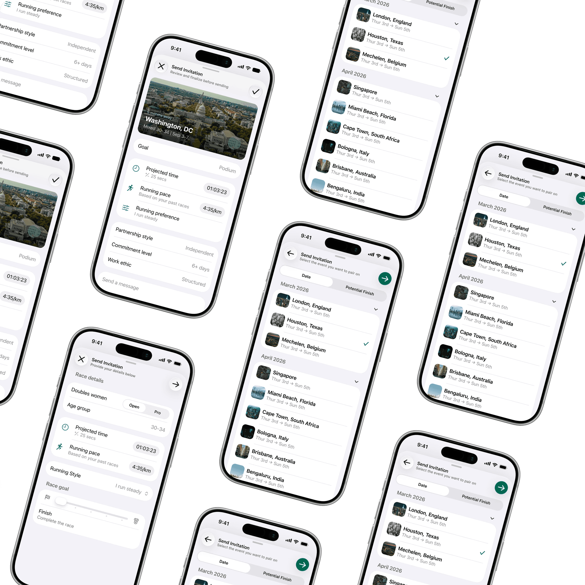
Check out some of my other work.

Matchrox

Fitness
|
Startup
|
SwiftUI
|
2026

Find your ideal doubles partner, lock in a unified strategy, and turn every workout into better race-day results.

Matchrox
Fitness
|
Startup
|
SwiftUI
|
2026

Find your ideal doubles partner, lock in a unified strategy, and turn every workout into better race-day results.

Three tablet screens displaying different interfaces of the SprintZero application, showcasing dashboards and agile team management tools with a blue background.

SprintZero 🔒

Future Of Work
|
Startup
|
Ant
|
2023

A web application harnessing generative AI to enhance the speed, efficiency, and cost-effectiveness of agile product teams.

Three tablet screens displaying different interfaces of the SprintZero application, showcasing dashboards and agile team management tools with a blue background.
SprintZero 🔒
Future Of Work
|
Startup
|
Ant
|
2023

A web application harnessing generative AI to enhance the speed, efficiency, and cost-effectiveness of agile product teams.

Three smartphone screens illustrating the Rental Property Management app's user interface for tenant satisfaction surveys and property listings with a pink background.

Rental Property Mgmt 🔒

PropTech
|
Startup
|
Elastic UI
|
2022

A mobile app for property owners to manage leases, track maintenance, and collect rent.

Three smartphone screens illustrating the Rental Property Management app's user interface for tenant satisfaction surveys and property listings with a pink background.
Rental Property Mgmt 🔒
PropTech
|
Startup
|
Elastic UI
|
2022

A mobile app for property owners to manage leases, track maintenance, and collect rent.

Two tablet screens depicting the Comply application, featuring colorful dashboards and regulatory reporting tools with a pink and purple background.

Comply 🔒

Finance
|
Enterprise
|
Motif
|
2020

A web application for financial institutions to reduce manual efforts and ensure accurate regulatory reporting.

Two tablet screens depicting the Comply application, featuring colorful dashboards and regulatory reporting tools with a pink and purple background.
Comply 🔒
Finance
|
Enterprise
|
Motif
|
2020

A web application for financial institutions to reduce manual efforts and ensure accurate regulatory reporting.

Let’s get in touch!

Already have a design in mind? Or want me to take care of everything?

Let’s chat and find out what’s best for you!

©

2026

Matthew Voshell. All Rights Reserved.

Version: Ø.9.8

Let’s get in touch!

Already have a design in mind? Or want me to take care of everything?

Let’s chat and find out what’s best for you!

©

2026

Matthew Voshell. All Rights Reserved.

Version: Ø.9.8

Let’s get in touch!

Already have a design in mind? Or want me to take care of everything?

Let’s chat and find out what’s best for you!

©

2026

Matthew Voshell

All Rights Reserved.

Version: Ø.9.8